When Typos Go Public: Ad, Billboard, and Packaging Mistakes
Embarrassing typos in visual assets are funny until your team is the one paying for the reprint, explaining the packaging mistake, or watching screenshots spread online. A billboard typo is not just a spelling problem. It is a media buy, a vendor proof, a brand review, and a marketing QA workflow all failing in public.
The examples below are modern, image-related typo mistakes: ads, billboards, packaging, highway signs, and digital billboard creative. They also show why proofreading images matters after copy has moved into a JPG, PNG, PDF, print proof, or installed sign.
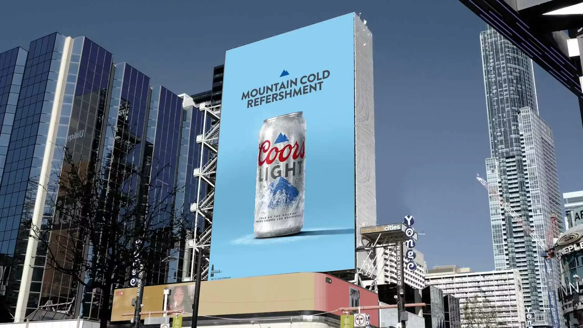
1. Coors Light: "Mountain Cold Refershment" in public ads
In January 2025, Coors Light put "Mountain Cold Refershment" into public ad creative tied to its Big Game campaign. PRNewswire carried the brand statement, and The Drum later published campaign context from the brand side.
Whether a public typo is accidental or intentionally used as a campaign hook, the QA lesson is the same: people react to the final image, not the internal rationale. High-visibility campaign files need a final visual proofreading pass after export, placement, resizing, and media trafficking.
2. Mattel's Wicked doll packaging: the wrong URL in fine print
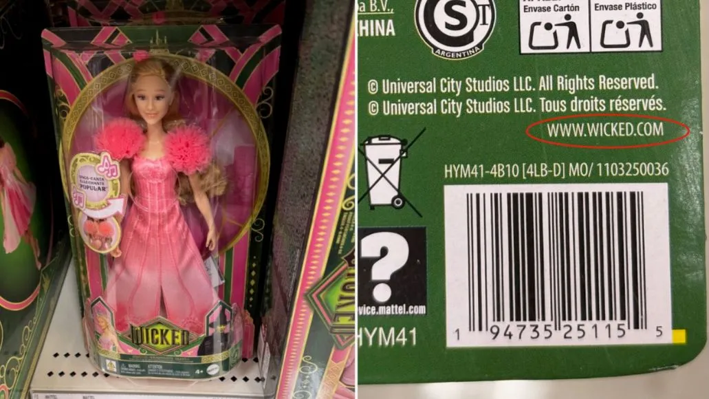
In 2024, Mattel's Wicked doll packaging printed a web address that pointed to the wrong site instead of the movie's official destination. Consequence covered the packaging error and Mattel's response.
This is a perfect reminder that small packaging text is not low-risk text. URLs, QR codes, legal lines, social handles, SKU details, support links, and safety copy deserve their own QA pass before a box, label, insert, or sleeve goes to production.
3. I-95 in Philadelphia: "Cenrtal Phila" on a highway sign
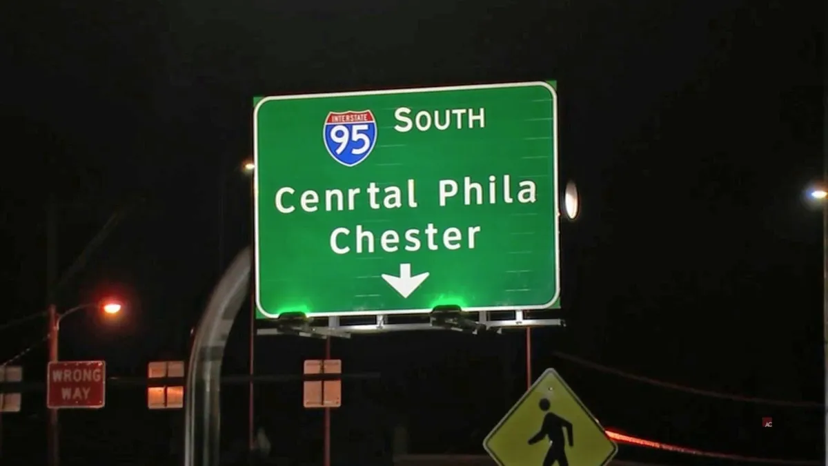
In 2024, drivers noticed a Philadelphia-area I-95 sign with "Cenrtal Phila" instead of "Central Phila." The Liberty Line captured the misspelling and the obvious question: how many approvals did that sign pass before installation?
Large-format text can be deceptively easy to approve too quickly because the word shape looks right at a glance. For wayfinding, event posters, outdoor banners, and retail signage, place names and brand names should be read letter by letter in the final artwork proof.
4. EBR Schools: "It's never to early" on a billboard
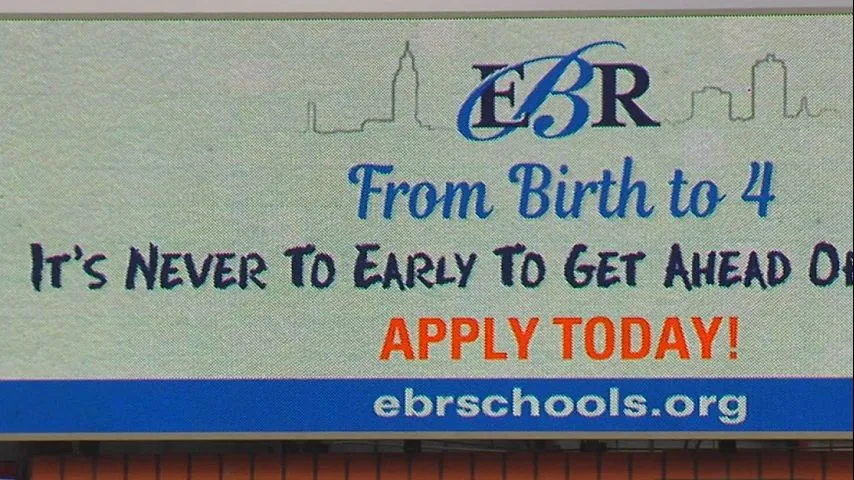
In 2019, a Baton Rouge digital billboard for a preschool program went live with "It's never to early" instead of "It's never too early." WBRZ reported that the school district's ad request included the correct spelling, but the typo was missed when the ad mock-up was reviewed.
That makes this a pure creative QA problem. The source copy can be right, the final billboard can be wrong, and a homophone error like to versus too may look normal unless someone reviews the finished visual in context.
5. Buc-ee's: "You Had Me At Hodwy" on a billboard
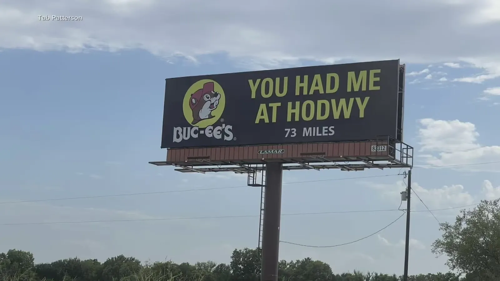
A 2023 billboard with "You Had Me At Hodwy" instead of "Howdy" became a viral example of how a short line can travel far beyond the paid placement. Chron covered how the brand leaned into the typo afterward, and Manychat included the billboard image in its analysis of typo-driven attention.
A billboard gives reviewers very few words to check, but that can create false confidence. Short headlines, slogans, and taglines should still be proofed aloud and reviewed visually, especially when they sit inside a paid placement that people will photograph.
Why modern visual typos slip through QA
These mistakes share the same pattern: the risky text lived inside the final asset. It was on a billboard, a package, a highway sign, or a final ad proof. Traditional document spellcheck is not enough once copy becomes pixels, print plates, vendor files, or installed signage.
If you are asking how to verify text in an image, the answer starts with the exact asset your audience will see. That means the exported creative, the final packaging proof, the social image, the print-ready PDF, or the vendor mockup, not only the copy deck or source document.
A practical visual QA checklist before launch
- Proof the final export. Review the image, PDF, print proof, or vendor file that customers will actually see.
- Run a separate details pass. Check URLs, QR codes, prices, dates, addresses, phone numbers, SKUs, coupon codes, and legal lines one character at a time.
- Read brand and place names letter by letter. Familiar words are the easiest to skim past.
- Recheck after every layout change. Cropping, resizing, localization, outlining text, file conversion, and vendor recreation can introduce new errors.
- Review the most visible words first. Headlines, slogans, packaging fronts, sign faces, poster titles, and billboard copy carry the biggest reputation risk.
- Use an image spell checker. Text inside graphics needs visual proofreading software, not just a document-based spellcheck.
Keywords this guide covers
Embarrassing typos, embarrasing typos, billboard typo, ad typo, packaging typo, sign typo, printed ad mistakes, typos in print, proofreading image, proofreading images, image speller, image spell checker, spell check picture, graphic proofreading software, marketing QA, design proofing, final artwork proofing, prepress QA, and grammar mistakes in advertising.
How Gard helps prevent these mistakes
Gard helps teams catch embarrassing mistakes before final visual assets get past QA. It reads text inside images, ads, billboards, packaging proofs, screenshots, and exported designs, then flags spelling, grammar, punctuation, awkward copy, and context issues in the same asset your audience will see.
Disclaimer: Gard provides automated design proofing powered by advanced AI. While highly accurate, we advise users to always conduct a final manual review of high-stakes business, medical, or legal graphics before sending to production.